


Lynn Reporting - OUTBOUND
This dashboard provides a comprehensive view of the behavior of campaigns executed in a tenant during a specific time period. It is designed for tenant administrators and other authorized users to monitor execution progress, assess performance by channel, and detect potential issues affecting campaign effectiveness.
By analyzing the included visualizations, users can identify trends, anomalies, and make informed decisions to optimize communication strategies and operational results.
At the top of the dashboard, users can select the name of the campaign they wish to analyze, helping simplify the view and facilitate data analysis.
It is important to emphasize that campaign statuses progress from one to another, meaning the report does not display the final status of each record, but rather all the states that the records have passed through. Therefore, the values in each state are not summable.
Campaign Progress Summary
This table provides a breakdown of the progress status of a specific campaign. Each row represents a status associated with the sending of records and allows monitoring how many records are at each stage of the process.
Data Interpretation
At the top of the table, the campaign name is displayed. The rest of the rows are structured as follows:
CampaignName: Name of the analyzed campaign.
Remaining rows contain:
- Record status.
- Number of records in that status.
Total: Total number of records associated with the campaign.
Ready: Records prepared and ready to be sent.
InProgress: Records currently in the sending process.
Sent: Records successfully sent.
SentInSession: Records sent within an active session.
Confirmed: Records whose delivery was confirmed by the provider.
Read: Messages that were read by the recipient.
Reacted: Records in which the user replied or interacted.
Canceled: Records canceled before sending.
Dnd (Do Not Disturb): Records not sent due to being blacklisted or restricted.
Overdue: Records whose delivery time expired without being sent.
Error: Records that failed to send due to a processing error.
Campaign Progress
This stacked area chart shows the evolution of record statuses for a campaign over time. It complements the summary table by dynamically illustrating how statuses such as Ready, Sent, Confirmed, and others have progressed during the campaign’s execution period.
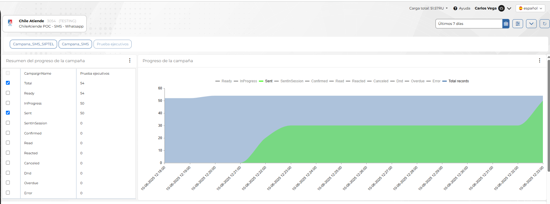
Chart Interpretation
- The X-axis represents time (execution dates), allowing you to identify when changes in record status occurred.
- The Y-axis indicates the cumulative number of records.
- Each color in the chart represents a different status.
- Hovering over a specific point displays a tooltip with the detailed values of each status for that date.
Chart Utility
This chart enables users to:
- Visually identify when sending started and how it progressed.
- Track whether records are moving correctly through each defined status.
- Compare the volume of sent records against the total planned.
This type of visualization helps administrators evaluate daily campaign performance and make real-time decisions to correct deviations or accelerate processes if necessary.
Records by Channel
This stacked area chart displays the distribution of campaign-processed records by the interaction source channel (e.g., WhatsApp, Facebook Messenger, Instagram, etc.). It provides a cumulative view of how many records have been handled per channel over time.
Chart Interpretation
- The X-axis represents the timeline (dates), making it possible to analyze the evolution of channel usage during the campaign execution period.
- The Y-axis indicates the cumulative number of records.
- Each color represents a different channel, clearly identified in the legend to the right.
- Hovering over a point on the chart shows a tooltip with the exact breakdown of records per channel on that date.
Chart Utility
This chart helps administrators and supervisors:
- Identify which channels are being used the most in the campaign.
- Detect spikes or drops in activity per channel over time.
- Compare behavior across channels to reallocate resources or adjust strategies.
- Check for inactive channels, which may indicate configuration issues or lack of coverage.
Use Case
An analyst could use this chart to determine, for example, whether WhatsApp is concentrating most of the campaign traffic and consider strategies such as:
- Reinforcing infrastructure for that channel.
- Evaluating the need to redistribute the campaign to other channels.
- Checking for delivery imbalances that could impact expected results.
Campaign Status
This bar chart shows the daily evolution of the campaign's execution status, specifically the Dialing status.
- The X-axis represents the execution dates.
- The Y-axis shows the number of records or events in the Dialing status on each day.
- Each green bar indicates that dialing activity occurred on that specific date.
This chart allows users to visualize:
- Active days when contact attempts were made.
- Execution patterns, such as pauses or resumptions in the dialing process.
- Sending consistency, identifying periods of low or no activity, which could relate to operational decisions, technical issues, or scheduling configurations.