


Health
This report presents a topology similar to the Application Map, a monitoring feature in Azure that is part of Application Insights—an application performance management (APM) service designed for web developers.
Application Insights is a Microsoft Azure service that provides tools to monitor, analyze, and detect performance issues in cloud-hosted applications. It also allows the insertion of custom traces and error logging.
The application map visualizes the full structure of the application through interconnected components. These components are identified by HTTP dependency calls between servers where the Application Insights SDK is installed.
Main buttons (located in the upper-left corner):
- Back: Returns to the previous level after selecting a specific node.
- IntoView: Re-centers the diagram view if zoomed or panned.
- Layout: Switches between organic and hierarchical views of the diagram.
Diagram Interpretation
Visualization and Connections
The map shows the full structure of the application using nodes and connecting lines.
- Nodes: Represent main components like services or servers and are enclosed by circles.
- Connection lines: Indicate request paths, showing the total number of calls and the average response time. They may also reflect bidirectional interactions.
Node Interaction
When selecting a node, a panel on the left displays the last four communication logs, sorted by date. Each log can be expanded for more details.
Error Identification
Errors in calls are highlighted in red, displaying the failure rate. This helps prioritize investigations and shortens resolution time by focusing attention on problematic areas.
Use Case
Description: A technical operations team is responsible for monitoring a web application hosted in Microsoft Azure. The app integrates with multiple services, APIs, and databases, and users have reported performance issues. The team must quickly identify infrastructure bottlenecks to resolve the problem.
Diagram Analysis:
Initial visualization:
- The team opens the report and views the overall application map.
- They observe nodes representing major components (servers, services, or databases) and lines indicating the interactions between them.
- Lines display the total number of calls and the average response time.
Error identification:
- One node is highlighted in red, indicating a high failure rate for requests to that component.
- The team checks the connection lines to identify which components are affected.
Node investigation:
- They click the red node to open the log table on the left panel.
- They review the last four logs by date to find patterns or repeated errors.
- They expand one log to analyze the error type and origin.
View adjustments:
- If the topology is large, they use the IntoView button to center the diagram.
- They switch between organic and hierarchical layouts using the Layout button to better understand relationships between components.
Decision-making:
- Based on the data, they determine the problem lies in a database service with high response time.
- They escalate the issue to the database team with detailed logs for quick resolution.
Additional Service Health Data
To access more reports than those shown in the main table, use the Show More button, which reveals all records within the selected date range for detailed analysis.
This section of the report provides an overview of application performance and stability for the analyzed tenant.
All charts include an interactive legend for enhanced data exploration. Clicking a legend item hides its values, allowing users to focus on the remaining categories.
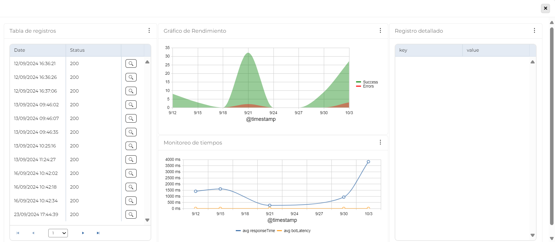
Log Table
Provides an overview of application behavior by monitoring events over time.
- Key data: Date and status codes (1xx, 2xx, 3xx, 4xx, 5xx).
- Purpose: Detect patterns, anomalies, and recurring errors to diagnose issues and improve performance.
- Quick access: Includes a button to open the Detailed Log for in-depth analysis.
Data Interpretation
The table contains three columns:
- Date: When the event occurred.
- Status: HTTP response status codes:
- 1xx (Informational): Request received, continuing process. Rare in logs.
- 2xx (Success): Request was successful.
- 3xx (Redirection): Further action needed to complete the request.
- 4xx (Client Error): Issues with the request sent by the client.
- 5xx (Server Error): Issues processing the request on the server side.
- A button to access additional details in the Detailed Log.
Use Case
Description: A technical support team is monitoring the performance of a critical application. A user reports errors when performing a specific operation. The support team uses this table to investigate the issue.
Table Use:
- Identify error patterns: Filtering logs by the user-reported time, the team observes an increase in 4xx and 5xx errors.
- Analyze specific causes: The status codes reveal many 403 (Forbidden) and 500 (Internal Server Error) responses—suggesting permission issues and backend failures.
- Quick detail access: Using the table’s button, they access the Detailed Log to see affected URLs, request parameters, and error messages.
- Take corrective action: The team adjusts access policies and restarts a backend service, restoring full functionality.
Performance Chart
This line chart visualizes application performance over time, helping identify error spikes and correlations between successful and failed logs. It shows the evolution of both types of events at specific intervals, aiding in evaluating system stability, detecting anomalies, and analyzing service reliability.
Data Interpretation
The chart displays two types of log lines:
- Error Line: Number of logs containing errors. Helps spot spikes or trends indicating problems.
- Success Line: Number of successful logs. Assesses expected performance and its correlation with errors.
Axes:
- X-Axis (Time): Shows variation across time intervals.
- Y-Axis (Count): Displays the number of events (successful and failed) in each interval.
Analysis & Usefulness:
- Detect spikes in errors and their impact on successful logs.
- Visualize trends for diagnosing issues and monitoring service reliability.
- Assess if errors are decreasing, stable, or increasing to support system improvement decisions.
Use Case
Description: The development and support team is monitoring performance after a system update. Users reported issues using certain features. The team must assess error trends and their effect on successful operations.
Using the chart:
- Identify affected period: The team selects the update date range. Spikes in the error line appear post-deployment.
- Correlate errors with success logs: A drop in success logs aligns with the error spikes, indicating a user experience impact.
- Analyze errors: The detailed logs show 500 errors related to backend failures introduced by the update.
- Correct the issue: The team fixes the configuration and restarts the service.
- Confirm recovery: The chart shows error reduction and success log recovery, confirming system restoration.
Time Monitoring
This chart provides a detailed view of app and bot performance over time, assessing their ability to respond efficiently to user requests. By combining application response time and bot latency, it helps detect patterns, bottlenecks, and performance issues. This aids in identifying the cause of delays, distinguishing between app and bot issues, and improving user experience and system stability.
Data Interpretation
The line chart represents:
- Application Average Response Time: Time taken by the application to respond to requests. Lower times mean better performance; spikes suggest issues.
- Bot Average Latency: Time taken by the bot to process and respond. Latency may depend on server load, query complexity, or external API calls.
Axes:
- X-Axis (Time): Evolves over intervals (days, hours).
- Y-Axis (Milliseconds): Shows timing metrics to assess app and bot performance.
Analysis & Usefulness:
- Identify performance patterns and bottlenecks.
- Distinguish between app-related and bot-related issues.
- Improve system stability and user experience.
Use Case
Description: Users report slow response times in the app and bot. The support team must determine whether delays are caused by the app, the bot, or both, and take corrective actions.
Using the chart:
- Identify affected period: The team selects the reported time range. Response and latency spikes are visible.
- Evaluate app vs. bot impact: The app response time is stable during bot latency spikes—indicating the issue is with the bot.
- Analyze latency causes: Spikes align with high request volume and external API usage, affecting bot response.
- Take corrective actions: The team optimizes the bot’s configuration, improves API call efficiency, and balances request load.
- Monitor results: The bot latency decreases and response times improve, confirming successful corrective actions.
Detailed Log
This table provides detailed information about a selected log entry, allowing in-depth analysis of individual events. Presented as key-value columns, it helps interpret critical information, detect issues or patterns, and support accurate diagnostics. This structured format enhances clarity and facilitates monitoring or debugging.
Data Interpretation
The table shows detailed information for a log selected from the Log Table and organizes the data in two columns:
- Key: Field name or identifier.
- Value: Specific content or data for each key.
This layout supports fast, efficient analysis by highlighting the most relevant details for understanding the event.
Use Case
Description: A user reports an intermittent error when performing a specific action in the application. The support team needs to investigate the log to identify the issue and apply the correct solution.
Using the table:
- Access the specific log: The team finds the log by filtering the Log Table using the user’s date and time.
- Analyze detailed data: In the Detailed Log, they examine keys and values. For example, Error_Code = 500 points to an internal server error.
- Identify patterns or additional problems: They check fields like Request_URL and User_ID to see if the error affects specific requests or users.
- Take corrective action: They discover a misconfigured backend service and resolve the issue by restarting or adjusting the service.
- Verify the solution: The team continues monitoring the logs to confirm that the error no longer occurs.